SAPS Retreat Railway Police Station
- click images to see larger version -
SAPS RETREAT RAILWAY POLICE STATION
Location: Retreat Cape Town (2007)
Clients: South African Rail Commuter Corporation / South African Police Service
MOKENA MOKEKA / HOLGER DEPPE
MAKEKA DESIGN LAB
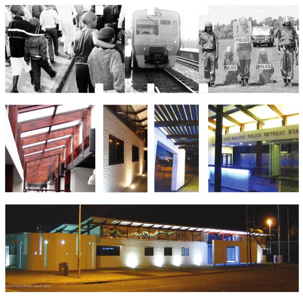
The Retreat Railway Police Station acknowledges that a better public engagement can be fostered by fashioning spaces and environments that promote transparency and visibility, which are open and welcoming, and most importantly are safe and accessible. The building plays its part in the narrative of a better, more efficient and more connected South African Police Service to be used and accessed by the citizens it serves.
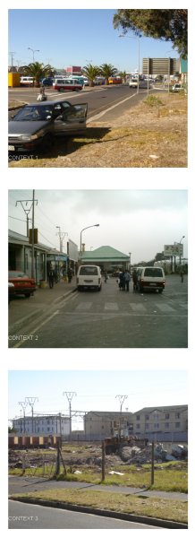
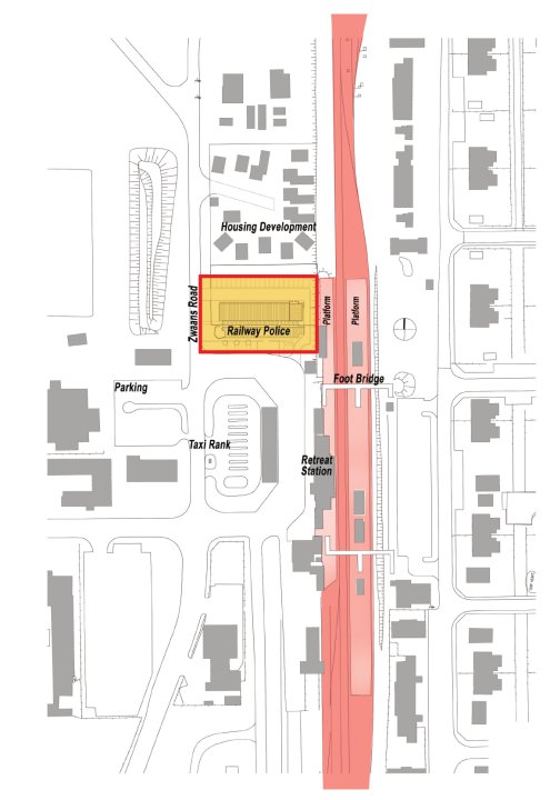
The client SARCC (today: PRASA) has chosen strategic locations at major junctions within the Western Cape Rail network for four new Railway Police Stations in order to improve safety and security for railway customers. One of these is Retreat, a low income suburb in the Cape Flats.
The police station provides the northern edge to an existing square in front of the railway station. The square is largely occupied by a taxi rank. The surrounds consist mostly of low scale commercial and light industrial development. Low income housing stretches from the other side of the railway line onwards.
During Apartheid, Institutions were entrenched for the use and protection of a limited minority group. After 1994 the country has been faced with the challenge of the reconstruction of institutions to serve the needs of a greater majority – such as the Constitutional Court. Retreat Police Station makes a valuable contribution to an approach that redefines the police station building typology of South Africa.
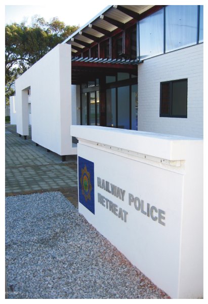
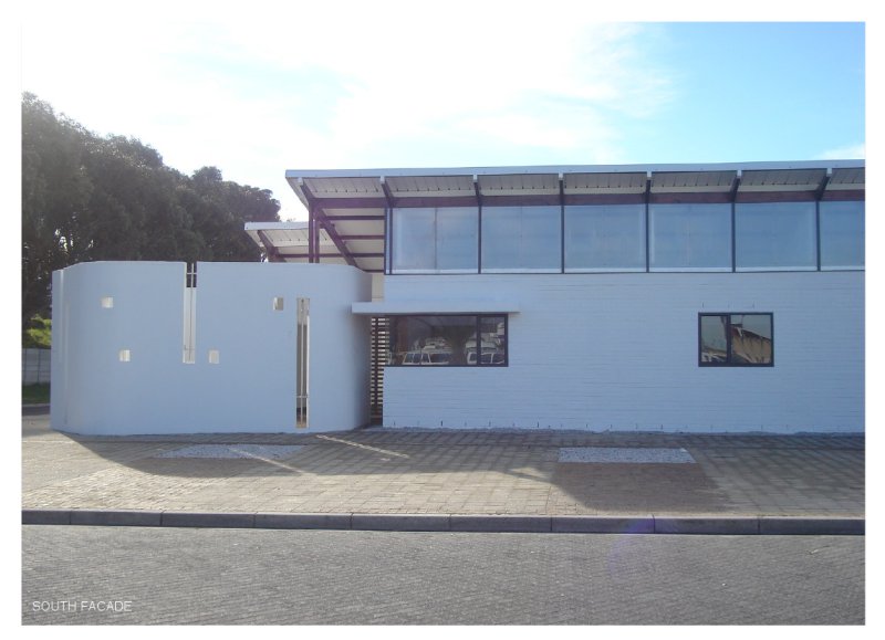
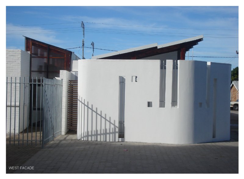
Police stations need to represent safety and security instead of the historic representation of a force of fear and oppression. This is achieved through a design language of transparency, identity of service and well-being. The building has a strong presence flanking the station square with its entrance marked by a screen wall and a glazed entrance foyer. The entrance and foyer with its service desk are directly visible to the taxi rank and other public zones and invite rather than repel. Through its openness and choice of material the design response fosters a sense of pride and encourages dignity and self respect.
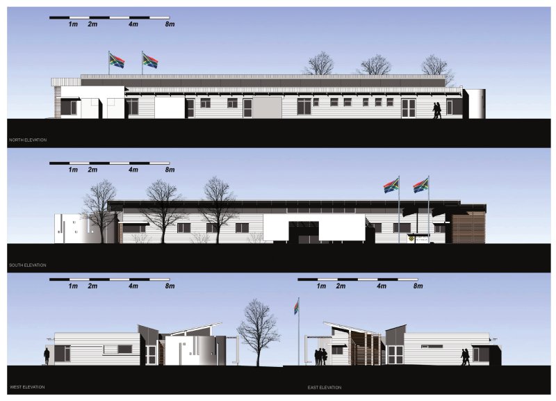
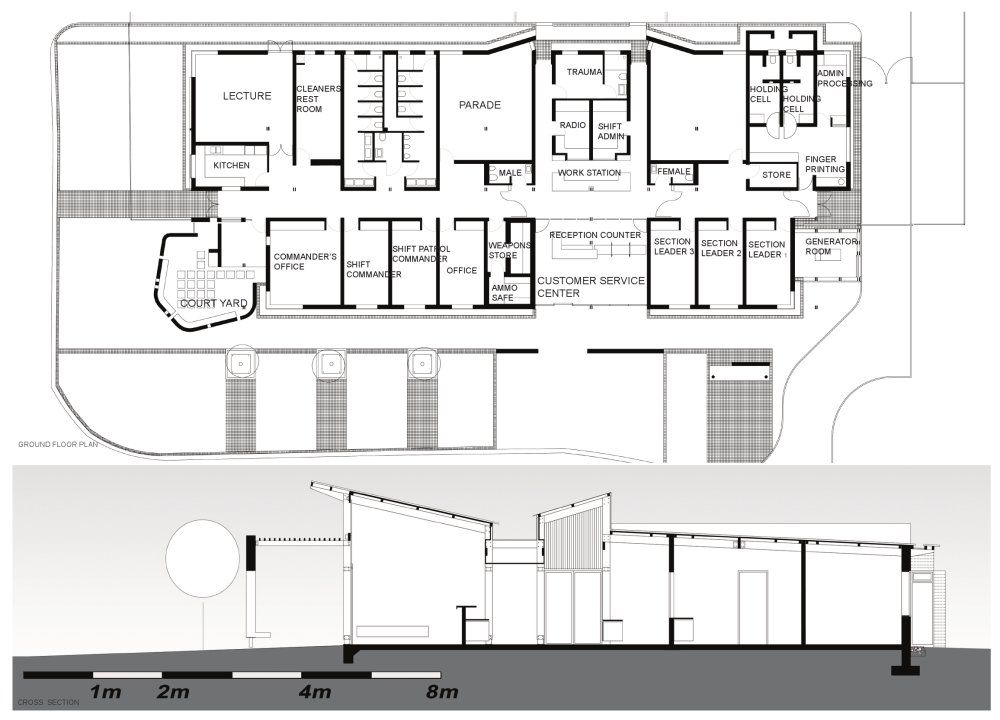
The building’s simple rectangular form provides a strong, well-scaled edge to the square while the articulation of its ends provides formal interest. The building achieved a high degree in cost effectiveness through a minimalist approach to construction and material. This is reflected in the timber structure under use of SA pine and carefully designed connecting elements in steel. A transparent multiwall product was used for all clerestory glazing. From inside the foyer, SAPS operations are visible and sensible through the lowered screen behind the service desk.
The mystery of light is explored both in an effort to create a design that excites the imagination and that changed with the changing light of the day. It is a civic structure that is delicate at the human scale.
The environment created by this police station is that of openness and provision of service to the people. The sense of dignity reflects itself by the high acceptance of the building in the public and within the police force. The sense of identity and value of the work of the police is welcomed by the individuals working at this station.
The importance of rail as backbone of public transport for all people but specifically for those with lower incomes is emphasized by the provision of a safe and secure environment, for which this building is one piece in the puzzle.
Awards:
CIFA Award of Merit 2007 - Inaugural recipient of the Gold Loerie Award for Three Dimensional & Environmental Design-Architecture.
